What will be automatized next? A preview of the next business shifts

I recently stole this chart from a U.S. think tank called the American Enterprise Institute, and it's fascinating. The charts essentially compound the price evolution of key consumer goods against inflation for the last +10 years:
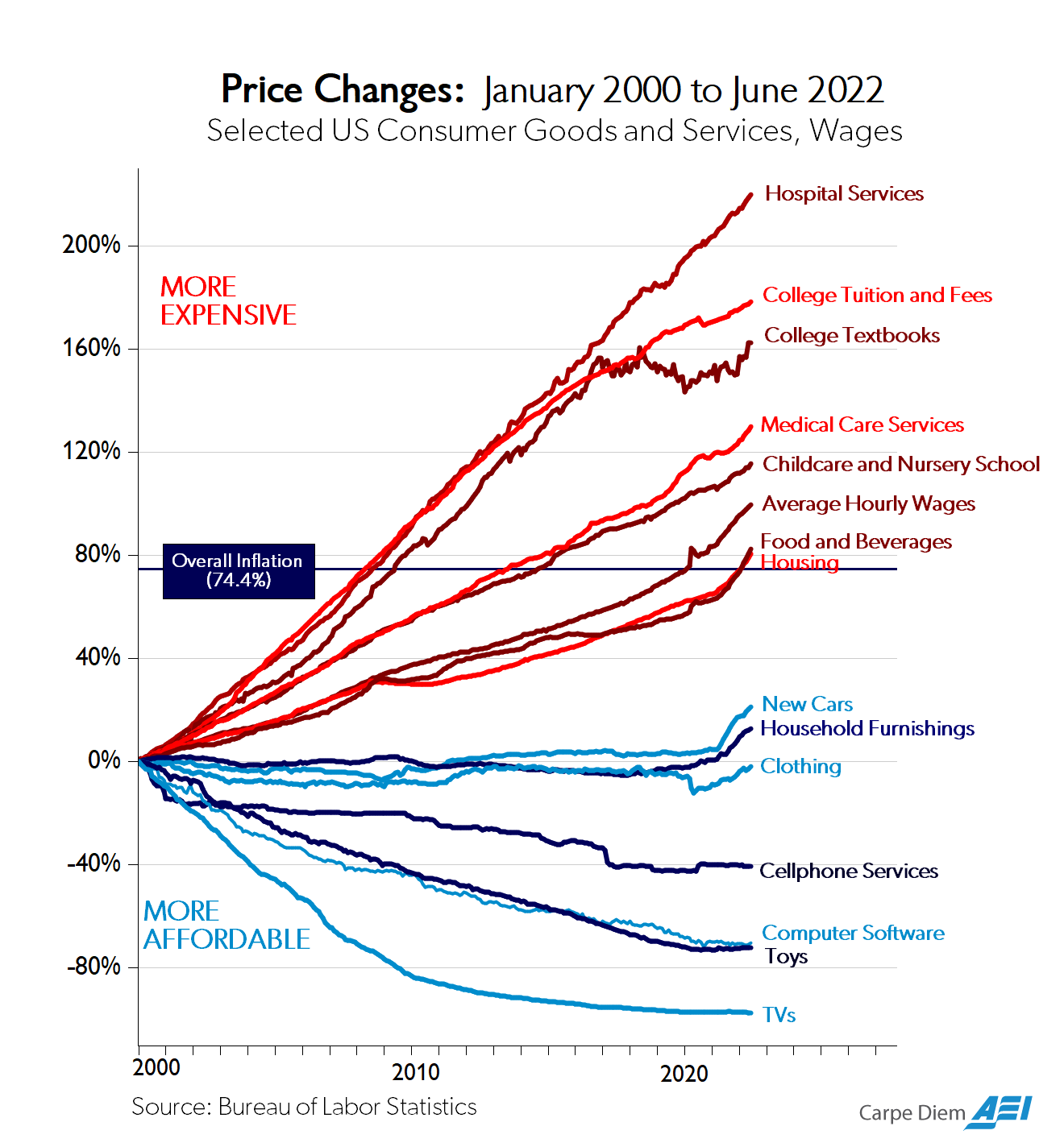
Mostly, the American think tank argues that the government is bad as prices regulated by an American public organization of the federal state are going up (red), and the ones on the free market and deregulated go down (blue) 🙄
I'm not even going to take the bait and discuss how private companies in the U.S. have fully gamed governmental regulations, which means that this chart probably mostly explains how Europe is (still) better at having functional regulations... If in doubt, check our hospital costs or the price of a monthly high-speed internet connection vs. the U.S.
But this is not what I find fascinating with the chart.
What I find interesting is that you can safely bet that all 'red lines' goods show you the sectors that will be impacted first and with the highest economic leverage by AI and automation in the next decade.
More than automotive, construction, or IT.
And remember that most GAFAMs are already quite aware ...